
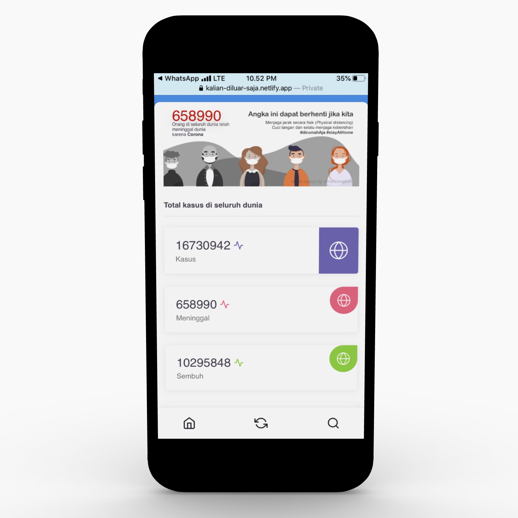
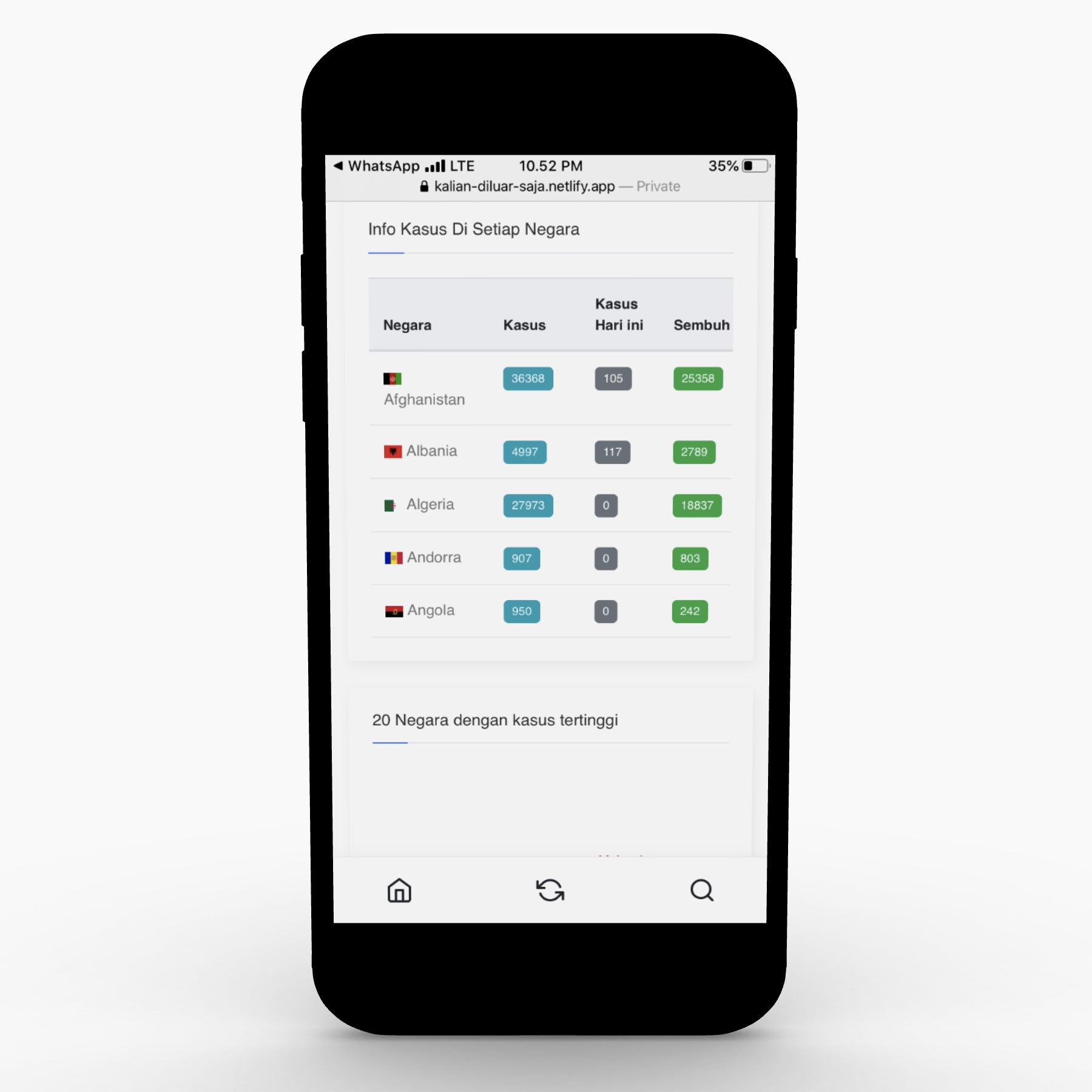
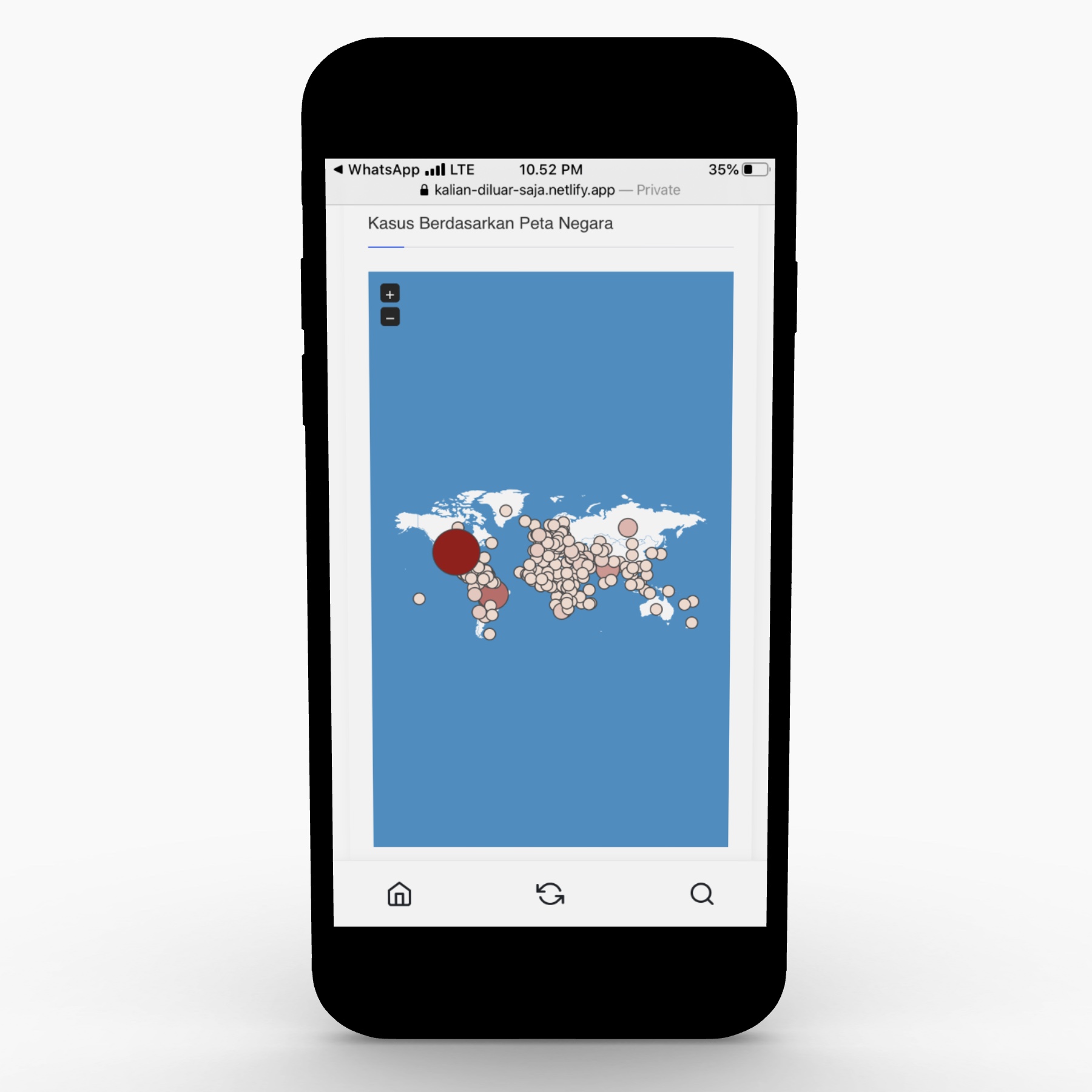
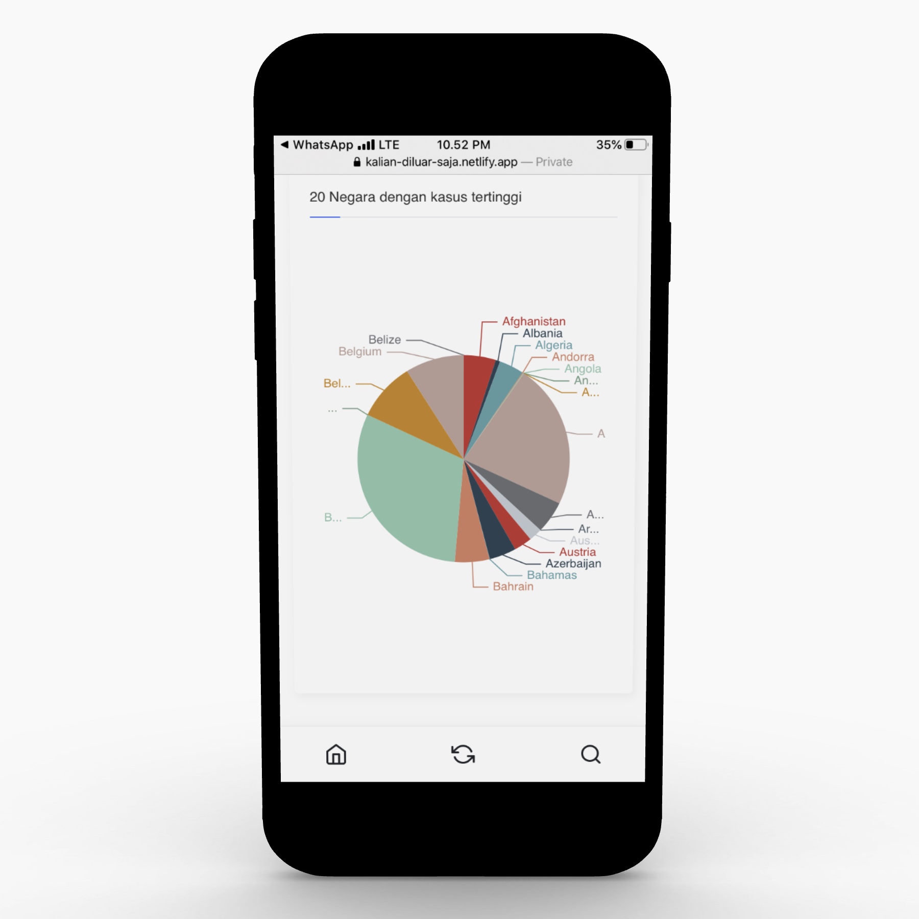
According to the WHO.int, the best way to prevent and slow down transmission is be well informed about the COVID-19 virus. Which is why I decided to create an open-source dashboard, to make it easy for anyone to explore the real data. For the tech-stack, I used Python, Django and Plotly API. With awesome data sources ranging from Johns Hopkins to NY Times, and more.
- Software Engineering
- Data Engineering
- Dev Ops.
- Web Development
- UI/UX Design
- All Country
The site attracted over 2,000 visitors globally 🌎, and has recieved tons of positive feedback from developers and users alike. In my eyes, informing just a few over the seriousness of the pandemic, and having created an avenue for open-source developers to pick up new skills, is a victory after all. Development and marketing is ongoing! 📈
